The era of authenticity has arrived – picture-perfect ads no longer have the same cut-through, and consumers want to see themselves reflected in the brands they’re buying, writes Nathan Chambers, Head of Design at Stanley St. He shares with StopPress how this new era is changing the way the industry operates.
We’ve all noticed it. The polished, picture-perfect ads that once ruled the marketing world don’t seem to connect the way they used to. People today are more aware than ever, and they’re not easily impressed by flawless imagery or too-good-to-be-true messaging. There’s a general mistrust in the air. People want realness – they want to see brands that reflect their everyday lives, imperfections and all. The era of authenticity isn’t just creeping in – it’s already here, and it’s changing how we design, market, and communicate.
At Stanley St, we’ve seen this shift up close. It’s not that glossy ads have no place anymore – they do. But alongside the polished campaigns, there’s a growing need for authenticity. People want to feel a genuine connection with brands, and that means showing real skin, real body shapes, real food, travel, stories, embracing the natural over the artificial. It’s not about perfection anymore. It’s about trust.

Authenticity isn’t just a buzzword – it’s everywhere
Authenticity has become more than a trend – it’s essential. Whether it’s advertising campaigns or the way we engage on social media, people want brands that show something real. Take Dove, for example. Their Real Beauty campaign set the standard by showcasing real people with real bodies, unretouched and unapologetically themselves. This approach was groundbreaking at the time, but now it’s becoming the baseline. Consumers are demanding to see themselves reflected in the brands they engage with.
At Stanley St, we’ve embraced this shift. Our work isn’t about ditching the glossy aesthetic altogether – there’s still a time and place for that (plus people still love to dream a little). But we’ve learnt that balancing authenticity with polish is key to resonating with modern audiences. It’s about knowing when to keep things raw and relatable, and when to elevate the visual quality for impact.
What does this look like in design?
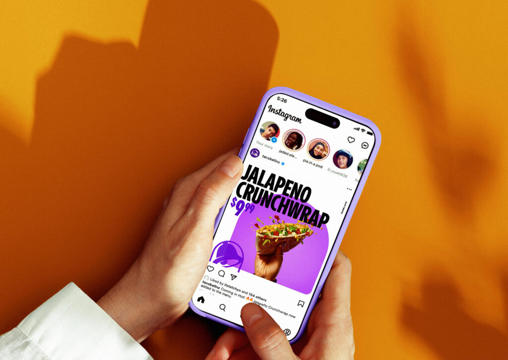
We’ve worked with Taco Bell on a campaign aimed at connecting with Kiwi audiences in a relatable way. In essence, we needed to solve the challenge of selling Mexican food to Kiwis, a cuisine less understood compared to pies, burgers and chicken. The design needed to be clean, straightforward, with a uniquely Mexi-Kiwi tone. By taking a minimalist approach, albeit with a bright, juicy colour palette, the product took centre stage without overcomplicating things. This simplicity helped the campaign and visual tone resonate with local audiences because it felt honest and true to the brand’s identity.

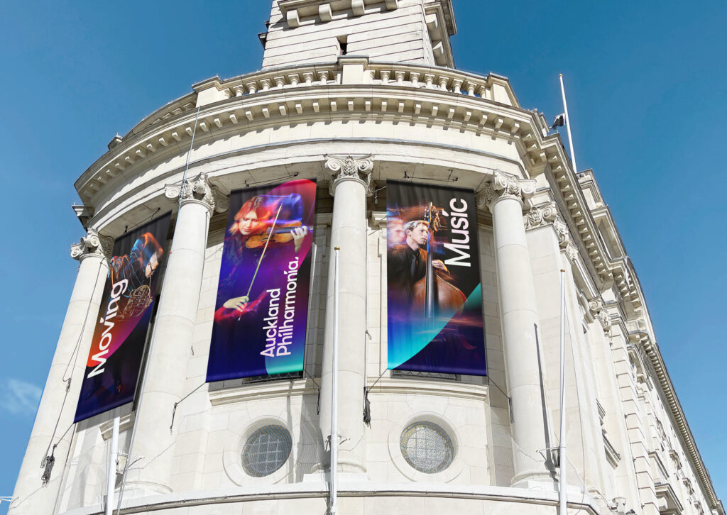
Similarly, for Auckland Philharmonia, we captured the essence of its Moving Music campaign by using natural, simple musical imagery rather than relying on heavy post-production. This approach led to a deeper emotional connection in all comms and also with the audience (which needed to include a much younger demographic). Given many of their season’s concerts were sold out proves that authenticity often strikes a stronger chord than overly polished visuals.

Consumers are tired of the fluff
Today’s consumers are savvy. They can spot something inauthentic a mile away, and when they feel a brand isn’t being real, they switch off. No one wants to be sold a fantasy – people want to see something they can relate to. That’s why, as designers, it’s on us to create work that builds trust from the start. Every design choice – from the insight, the tone of voice, colours to the typography – needs to feel aligned with the brand’s true values. Another way of putting it is that design is not the ambulance at the bottom of the cliff, ready and waiting to rescue your brand or marketing at the last minute. Authenticity can’t be faked; it must be baked in from the start.
But there’s another factor we can’t ignore – AI. While it’s an incredibly useful tool, it raises an important question: can something generated by an algorithm feel truly authentic? AI can handle the repetitive tasks and even offer up creative ideas, but it’s still the designer’s job to ensure the final output feels real and human.
AI and authenticity: striking the right balance
AI is transforming the way we work. It’s also deeply wired into a good chunk of our software and search engines already. However, if we’re not careful, it can also strip away some of the authenticity that people crave. Used thoughtfully, AI can help streamline the creative process, allowing designers to focus on the bigger picture – like storytelling and brand values. But if we lean too heavily on it, we risk creating designs that feel too calculated, too perfect – which ironically makes them quite vanilla.
At Stanley St, we use AI to handle the technical aspects – like generating variations of a concept or personalising content – but the final decisions always rest with our designers and most often end up being made by hand or photographed in a more traditional sense. The goal is to make sure AI supports the creative process, without overshadowing it. Transparency is key here. Consumers appreciate knowing when AI has played a role, and hiding that involvement can erode trust.
The rise of minimalism and simplicity
Another big shift tied to authenticity is the rise of minimalism in design. Less is more, and in a world saturated with content, consumers are drawn to brands that cut through the clutter with clean, simple visuals. Minimalist design strips away the unnecessary and lets the message stand on its own – no frills, just clarity.
Take Liquid Death – the global canned water phenomenon. Their marketing and designs are a masterclass in simplicity and clever tone of voice. Simple packaging, environmental, straightforward messaging with a twist of humour – what you see is what you get. People love this because it feels honest, direct, and free of unnecessary fluff. And in today’s landscape, that’s exactly what people are looking for.
Authenticity equals loyalty
At the heart of all of this is connection. People want to connect with brands on a human level, and authenticity in design is how we help make that happen. It’s not about being perfect – it’s about being real, relatable, and trustworthy. As designers, we have a huge role to play in building that trust and pushing New Zealand design thinking forward.
The post Why authenticity in design matters more than ever appeared first on stoppress.co.nz.
More Stories
Gamecocks Coach Dawn Staley Takes Time Out to Thank Local Media After Team’s National Championship Loss
Kit Kat Revives Its Iconic Tagline With the ‘Break Brothers’ as Hershey Steps up Marketing
Your Global AI Strategy Needs a Cultural Upgrade