PARIS, Sunday: The International Olympic Committee has unveiled its brand identity for the Olympics, which includes custom typefaces, illustrations and graphics that aim to bring the legacy of the games into the modern world. The next Olympics will be held in Paris on 26 July-11 August 2024.
Canadian creative agency Hulse & Durrell partnered with the IOC to develop three custom typefaces, a series of graphics, 17 illustrations and a set of guidelines for how to incorporate the identity.
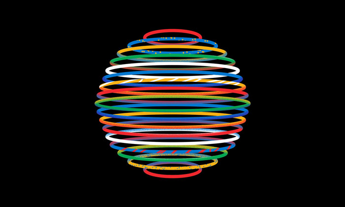
The new look includes a spherical graphic coloured in the Olympic brand colours, and illustrations have been added to the Olympic brand identity.
Switzerland-based IOC head of brand management May Guerraoui said: “The brand is a living beast, it’s not something set in stone, but really our wish was to put the athletes, the sports and the games part of the system and we all really felt we need to be more consistent.
“The evolved brand pushes further the Olympic brand identity through a vibrant extended palette based on the Olympic colours, inspirational illustrations and tailored-made typography – it’s about leveraging on a new design system to communicate the brand values with emotion,” Guerraoui said.
“The Olympic logo with its five interlocked rings, which were designed by the founder of the modern games Pierre de Coubertin in 1913, remains unchanged.”
While the Olympic Games began in 1896, this is the first time a global brand identity has been created. The IOC began working on the project in 2018 and some aspects of it, such as the custom-designed typefaces Olympic Headline, Olympic Sans and Olympic Serif, have been rolled out over the past four years.
The typefaces were designed by graphic designers Fabian Harb and Seb McLauchlan from Swiss type design agency Dinamo, and Julien Hébert of Canadian design studio Principal, while artists Francesco Ciccolella, Abbey Lossing and Karan Singh created the 17 illustrations for the brand identity.
May Guerraoui said: “With the full brand rollout expected to be completed in time for the Paris 2024 Olympic Games, the updated brand identity will be used across all touchpoints of the brand including on banners, press releases and social media platforms.
“The Olympic logo with its five interlocked rings, which were designed by the founder of the modern games Pierre de Coubertin in 1913, remains unchanged.
“Although the primary colours found in the Olympic symbol – blue, yellow, black, green, red and white – have not been altered, the Olympic palette has expanded for digital interfaces, infographics and illustrations.
“Although many of these choices were made with digital touchpoints in mind, the entire project was a balancing act between tradition and modernity, print and digital, building a strong identity while also allowing flexibility.”
“In one way or the other, we adapted the rings to the new digital environments, we didn’t change the Pantone [colours] but we did change other specs for digital: CMYK and RGB.
“We did a big consultation across the organisation to really understand what are the different needs in terms of corporate identity,” Guerraoui said.
“Everyone admitted that we really need something consistent and powerful that leverages the Olympic rings and colour more.”
“The new identity also aims to channel the games’ sustainability commitments, as it is designed to have a lower environmental impact in its print and digital mediums.
“Sustainability is one of the biggest criteria we have in everything we do,” she said.
“Although many of these choices were made with digital touchpoints in mind, the entire project was a balancing act between tradition and modernity, print and digital, building a strong identity while also allowing flexibility.”
CREDITS
Client: International Olympic Committee
Agency: Hulse & Durrell
Creative direction and design: Ben Hulse and Greg Durrell
Art direction and design: Julien Hébert, Bryan-K. Lamonde, Principal
Illustrations: Francesco Ciccolella, Abbey Lossing, Karan Singh
Typefaces: Fabian Harb, Seb McLauchlan of Dinamo; Julien Hébert, Principal
- View the video
- More images here
- Yet to be updated: olympics.com
Share this Post
The post The IOC unfurls vibrant brand identity for the Olympics appeared first on M+AD!.
More Stories
Is Netflix In a Slump? Here’s What Its Q2 Earnings Suggest
The Real Convergence Story Is Happening in Local Markets
BusinessDesk and Range Rover bring back the CEO Index