In a market rooted in tradition, jewellery brand Four Words, together with the Motion Sickness Design Office, has redefined its identity to challenge conventional norms in how love is celebrated.
Four Words has always stood apart from traditional jewellery brands. Without relying on decades of history, it offers a contemporary focus on individuality, passion, and expressions of love.
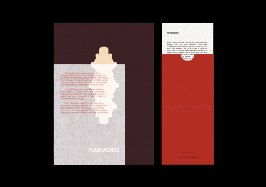
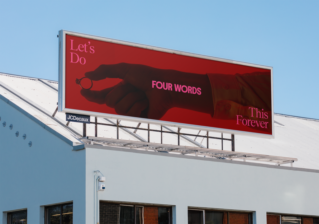
This brand project captures that, with a vibrant new identity and a rich red palette that deliberately shifts away from the whites and traditional golds that dominate the category.
Graphic silhouettes and typography add a subtle touch of elegance, reinforcing a balance of approachability and sophistication. The decision to “own red” as the brand’s signature colour captures the vitality and passion Four Words look to reflect in their bespoke pieces, while the iconography—referencing the silhouettes of their custom rings—provide a nod to the ever-shifting nature of love.
“When you look around the fine jewellery industry, you could take away the logo from all the websites and imagery, and they would look all the same and feel pretty sterile. The bold, rich red we’ve chosen is immediately identifiable both in the feed and in person. It resonates more with our customers who are looking to create something that is a bit different,” says Vinny Chauhan, Co-founder of Four Words.
More than just stunning rings; Four Words offers a fully tailored experience. The brand’s lab-grown, ethically sourced diamonds are chosen not just for their beauty but for their reduced environmental impact. Each piece is crafted through a collaborative process, with clients working closely with consultants to create something that aligns with their vision and values.
“In the early stages, we were a bit hesitant to go in such a different direction, which looked and felt quite different to the norms in the industry — would it alienate our core customers? But the Motion Sickness Design Office did a great job reassuring us that this was the right choice and easing our nerves about it. The team put forward a point of view and defended it rather than making changes because we asked for them. This was super valuable for us because when it’s your own brand, you’re a bit too deep in the weeds, and you can get in your head about it and be scared to make bold decisions,” explains Shivana Pemberton, Co-founder.
Since its inception, Four Words has been shaped by the desires of its clients. It’s a brand built around listening to couples who want more than the traditional, offering them the freedom to create something that feels uniquely theirs. This new identity reinforces that vision, delivering custom, ethical jewellery designed for love in all its forms.
“There’s a handful of super exciting projects on the boil at Design Office, and this is the first off the ranks,” says Hamish Steptoe, Senior Art Director at MSDO. “Working with Vinny and Shivana was an awesome experience; their openness and trust for seeing our vision; combined with their insight allowed us to craft a brand identity that resonates deeply with their vision and audience.”
The post Four Words rebrand challenges traditions in jewellery appeared first on stoppress.co.nz.
More Stories
Over $100k initiative powers up Auckland’s indie stages
Acing Brand Experience With Mammut CMO Nic Brandenberger
Outward Bound leans into uncertainty with fearless new platform